Design Projects
Click on a thumbnail to learn more about that project.

Gold Coast Bus Routes Map

DotA Items Map/Chart
Subject Icons
Gold Coast Bus Routes Map
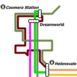
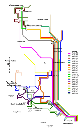
A project started in 2012, this project was formed out of the frustration at Gold Coast bus maps at the time only showing limited details into high frequency highway services. In its early versions, emphasis was placed on route placement to effectively illustrate how buses in real life actually approached a bus stop by direction and interaction/intersection with other bus routes. This was successfully achieved with the Coomera/Helensvale areas, and the Varsity Lakes Train Station Area.
Later however, as more detail into inland (non-highway) bus routes were added, there were placement inconsistencies in that two stops vertically aligned on the map might actually be oriented diagonally from each other in real life. Such is the price of simplifying concepts to display visually on a map, but soon it became too inaccurate to work with correctly.
Translink later came out with several versions of a full Gold Coast Bus Routes Map however, unlike their previous maps for parts of Brisbane and Sunshine Coast, instead of individual linked white circles marking major intersections, they were all covered with a huge label depicting the bus stop name. This affected the readibility and continuity of following route lines significantly.
In my version of the Gold Coast Bus Routes Map, I aim to bring this style back, to create a map that is detailed, is easy to read and not affected by crowding or obscurity.
Latest version: 12 Decemeber 2012
DotA Items Map/Chart

Click image to view full image in new tab/window.
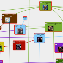
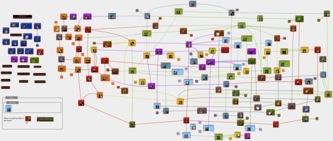
This project dates back to 2010, where I became interested in Defense of the Ancients (DotA), one of the most popular mods/maps for Warcraft III. DotA has a complicated item system, with upgrading of many tiers of items intertwined with each other. The in-game shops did not help with the overall picture of exactly what each item could be upgraded into.
I began to visualise the links between these items in a mind-mapping program called VUE. Early versions were quite item and link incomplete and began to get messy. To counter this, I first positioned items geographically close by shop drawing arrows from shop to item. Later I opted to colour each item box a different colour according to shop. Colouring individual links between items helped with readability but the layout was still quite messy.
In v0.9 I began a full rearrangement of the layout. Items were more spaced out and links were positioned, sometimes curved to avoid colliding with other items. Where links crossed there was a clear angle (ideally perpendicular), so no link or item was confused.
Subject Icons
In late 2009, I was really excited that I would be getting my own computer when I went to the Queensland Academy for Health Sciences (QAHS) the following year. I thought of ways to keep my school files organised. I didn't want the same default folder icon for all of my subjects, so to add some colour, variety and improve readability when browsing for folders, I decided to create some icons.
My first attempts were English and Maths icons, created in Inkscape. These were orb/sphere shaped (circle with 3D effect), and to illustrate the subject as much as possible I put lots of maths symbols and graphs for Maths, and words and people talking for English. However while the icons looked good at a large size, they were almost unrecognisable at a smaller size. I then replaced the content for the smaller sizes with a single letter. This led to another idea
Later, in 2010 when I knew what subjects I was taking I decided to create new icons in PowerPoint that would good at all sizes. I stuck to the really simple big, glossy single letter or symbol with radiating curves behind it as a background. These are what I used for the rest of my time at QAHS.
These icons are but just a small sample of icons I have created over the years, whenever I thought an icon was suitable, it was created.


